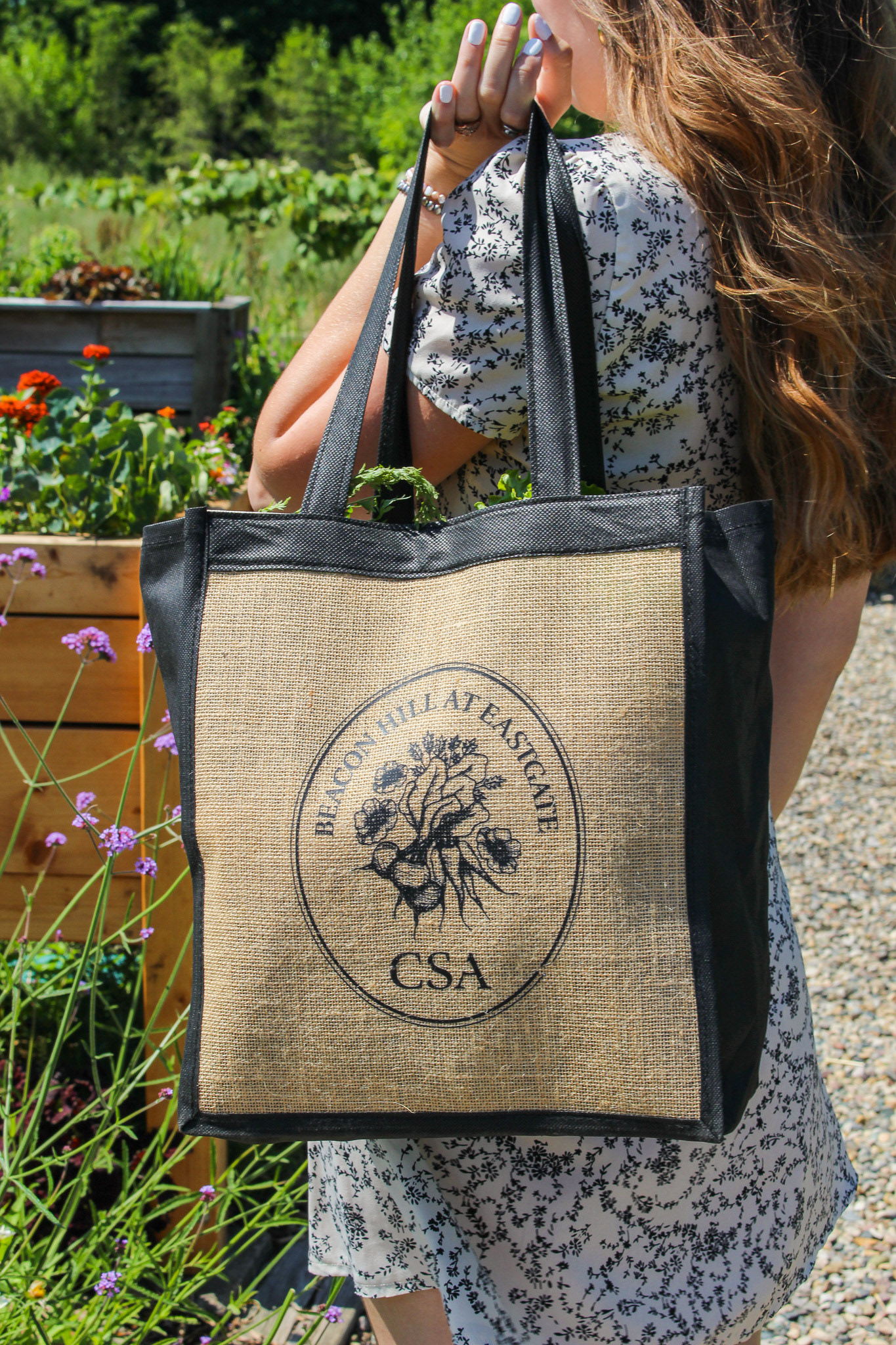
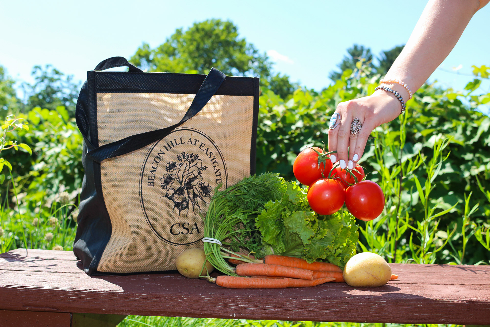
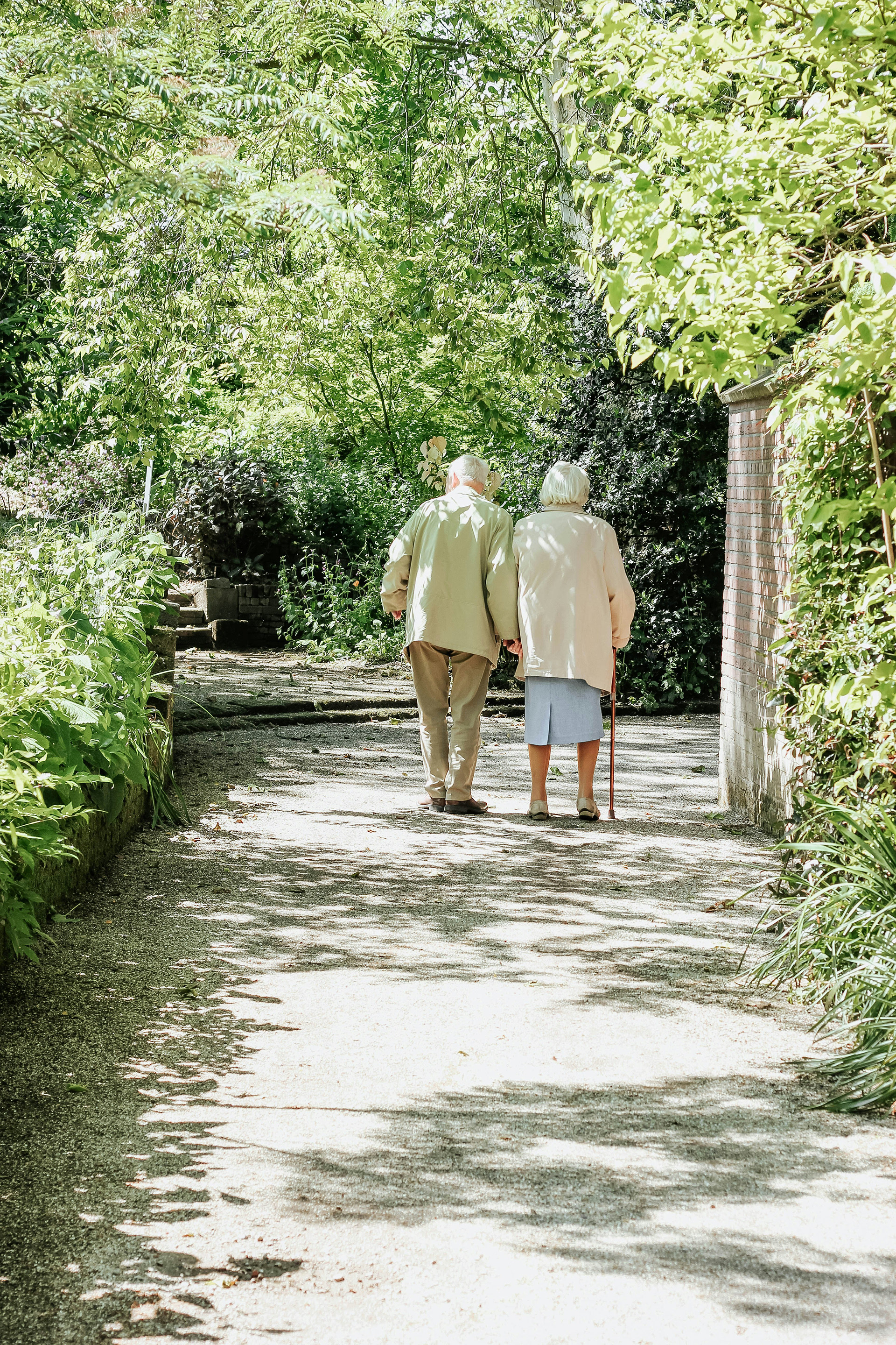
Community Supported Agriculture
Beacon Hill at Eastgate is a retirement community in Grand Rapids, MI, with a vibrant on-site garden that supplies its restaurants and gives residents space to grow their own produce. To expand access, they launched a CSA program where residents can purchase the weekly harvest. To support this initiative, Beacon Hill wanted to create personalized produce bags for residents to use when picking up their CSA shares.
LOGO DESIGN ILLUSTRATION
From the garden to the community

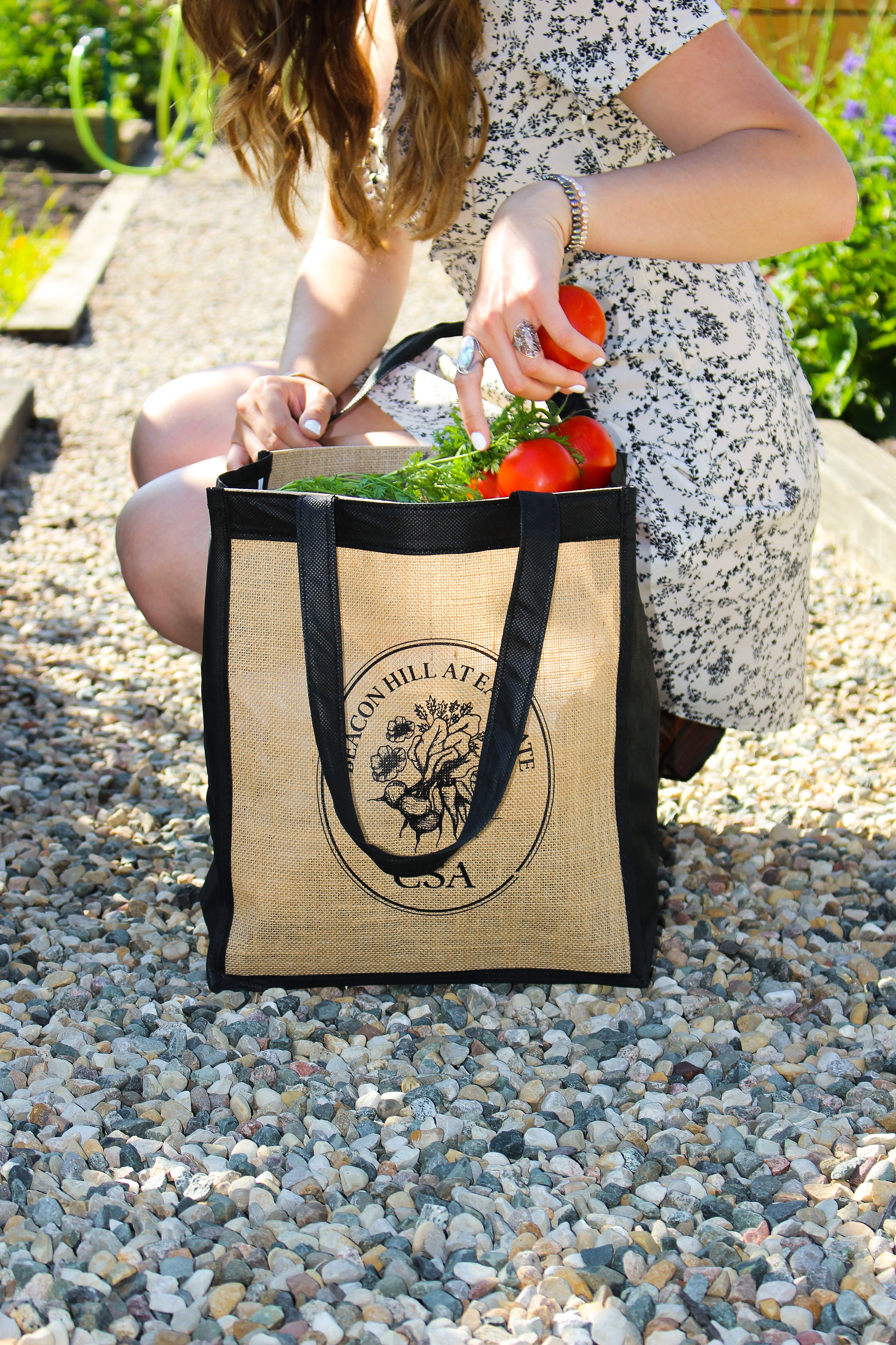
To reflect the values of freshness, community, and nature at Beacon Hill’s CSA program, I set out to design a logo that felt organic, hand-crafted, and rooted in the spirit of homegrown food. I began by sketching a variety of vegetables by hand, focusing on their natural forms and textures. These illustrations were then digitized and carefully composed into a unified emblem that celebrates both the produce and the people behind the CSA program. The circular composition and serif type add a classic, trustworthy feel, while the illustrated vegetables at the center bring in a sense of warmth, life, and authenticity.


Insights Gained
This project taught me that my artistic and drawing skills can play a valuable role in creating logos that feel personal and meaningful. It inspired me to explore how I can bring more of my creative strengths beyond traditional graphic design into my work. I also really enjoyed contributing to a project that supports a community, creates connection, and makes a positive impact.

Visual Branding
Beacon Hill at Eastgate is currently in the stages of launching a new project called Beacon Hill Living. They are working in collaboration with Urbaneer and Seamless to create "Smart Homes" for elderly citizens which provide technology to support them as they age.
LOGO DESIGN VISUAL & STRATEGIC BRANDING DRAWING

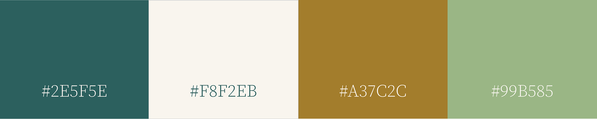
Flourish Community Balance
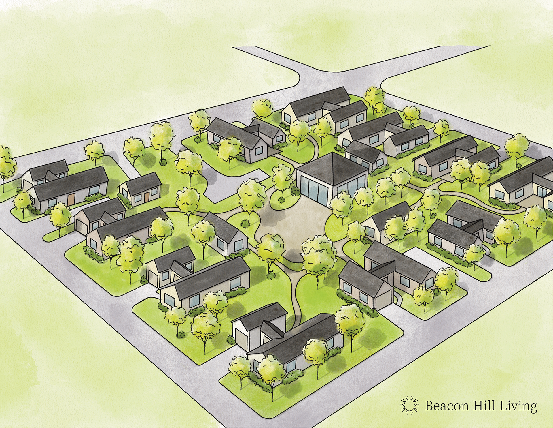
Inspired by the themes of peace, balance, and community, I explored ways to reflect these values through design. I created a logo, color palette, and selected typography that all work together to convey a sense of calm and connection to nature, especially with the project’s ties to northern Michigan. I was also tasked with enhancing an existing architectural drawing by adjusting details and adding color to improve clarity and visual appeal.

OutCome
The final brand feels calm, modern, and closely connected to nature. The logo and visual elements work together to express the values of the project while creating a unified and welcoming look. This project also gave me the opportunity to build a brand guide and create a cohesive system from start to finish.
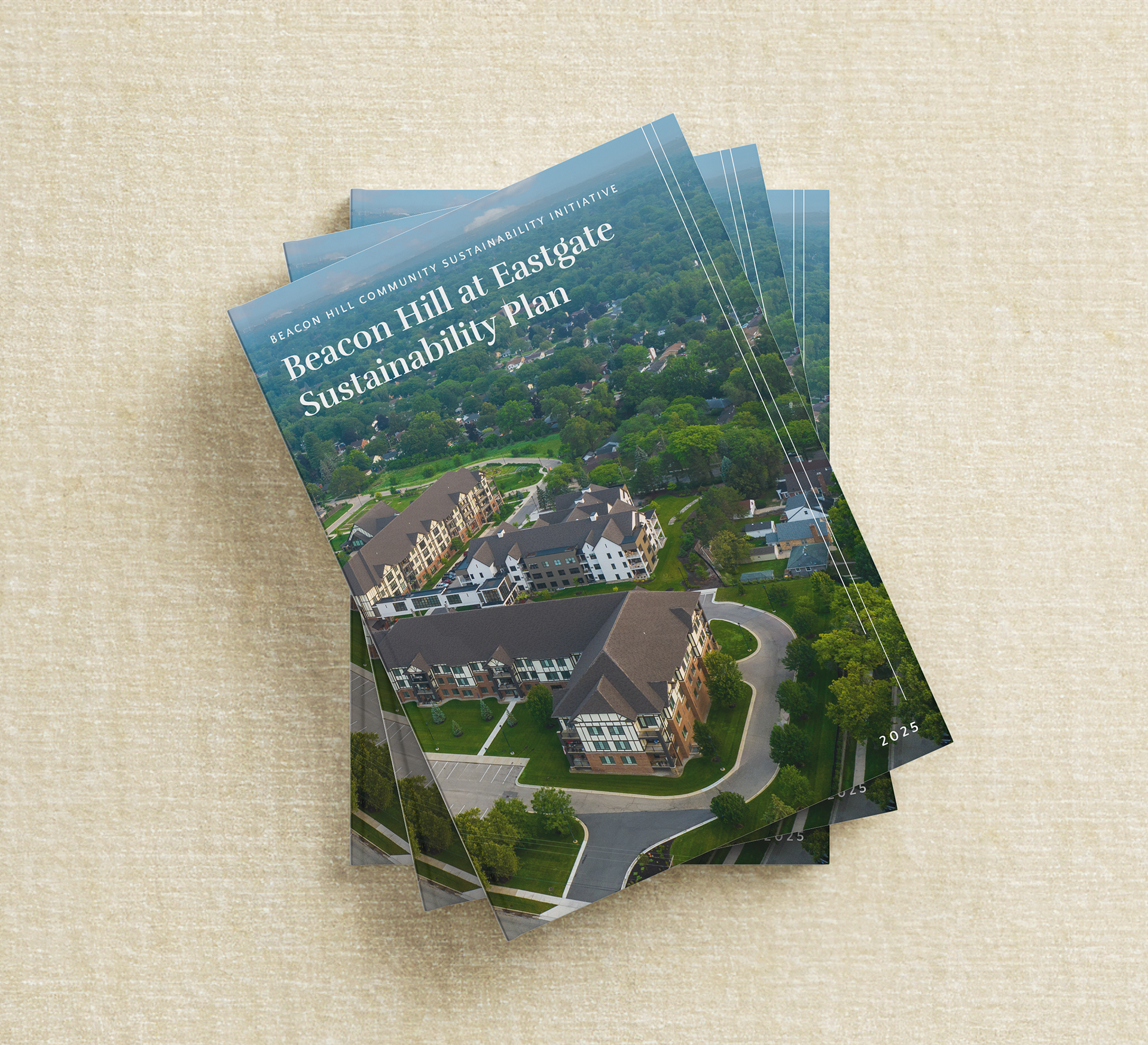
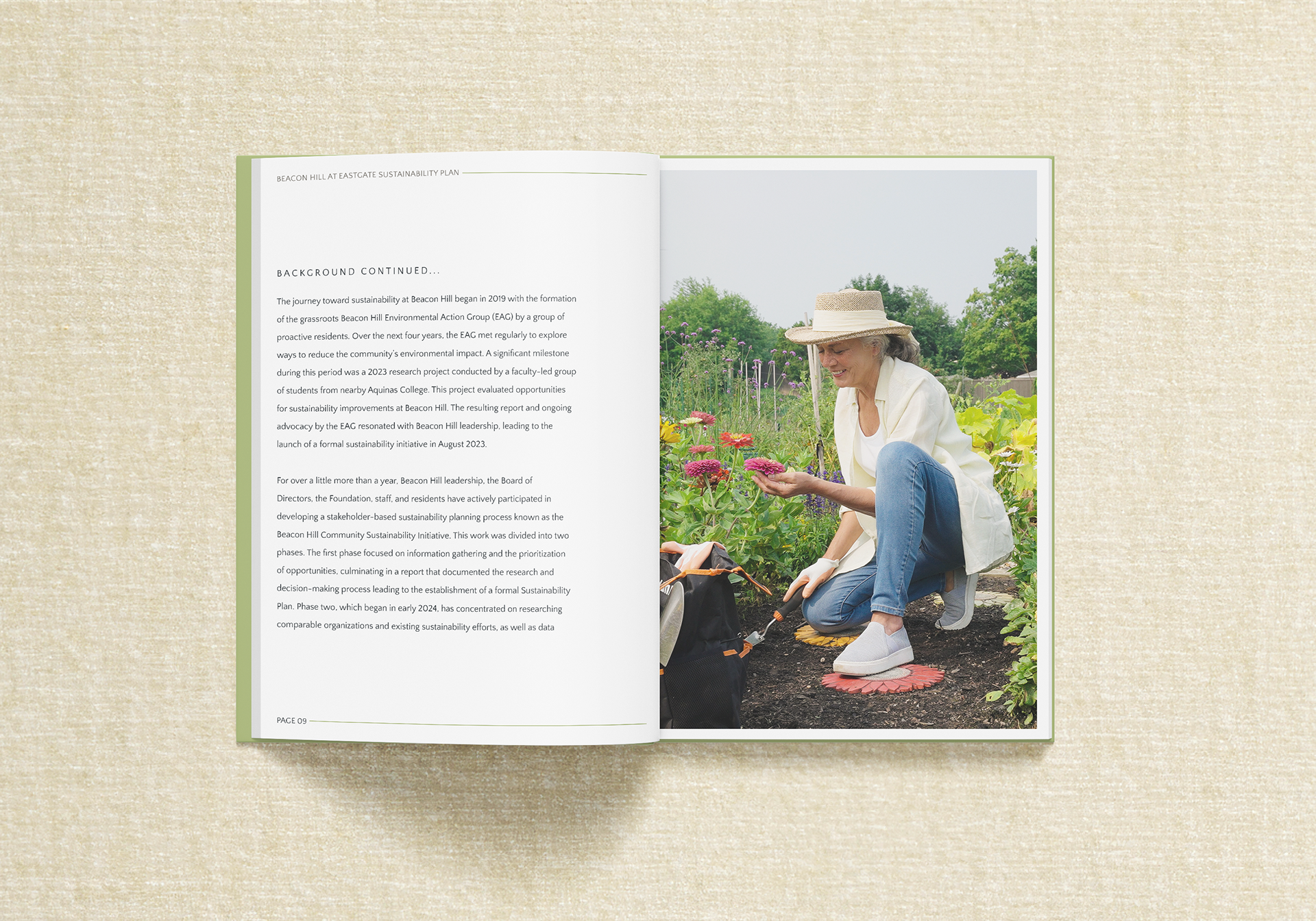
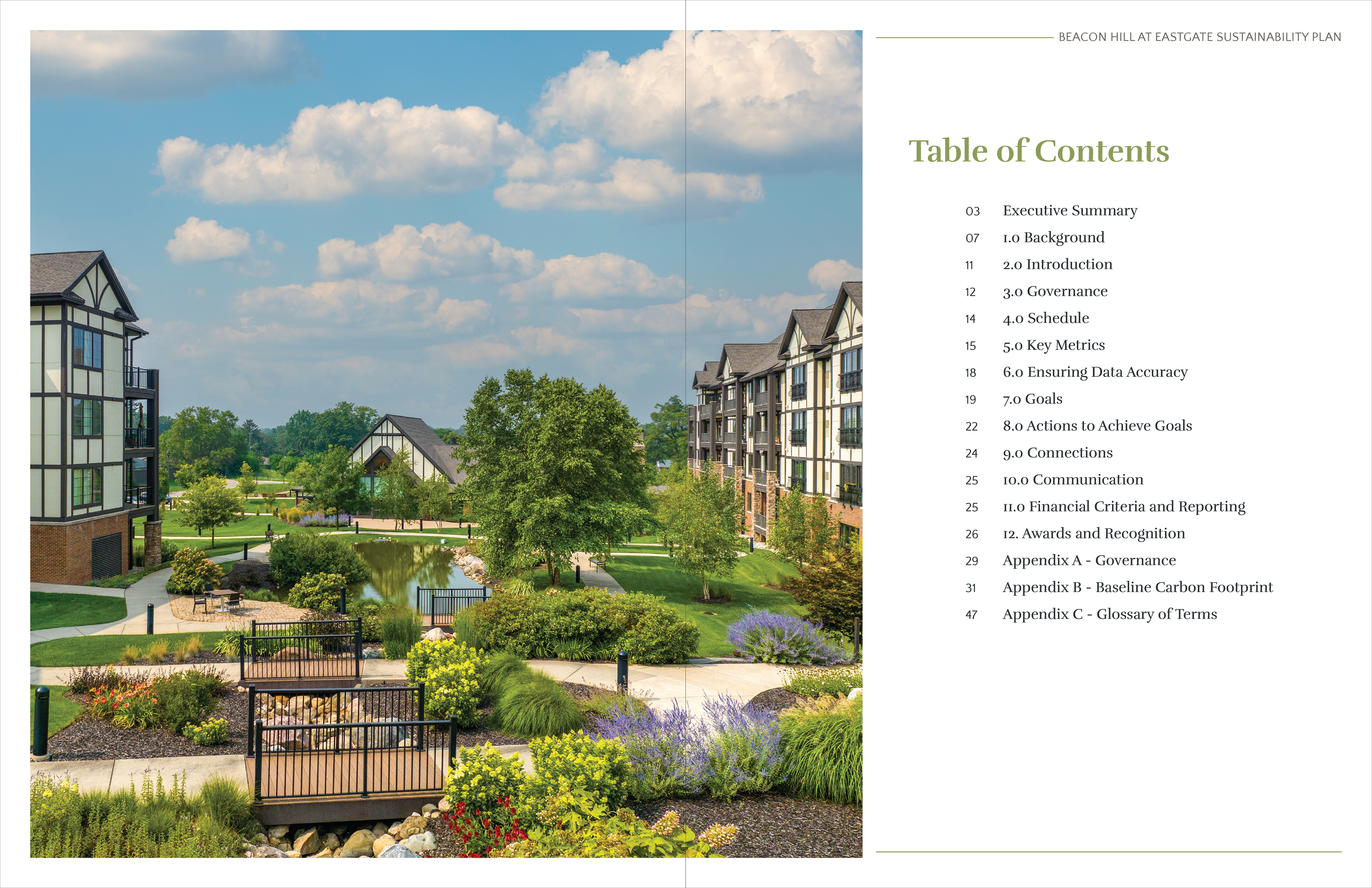
Sustainability Plan Book
Beacon Hill at Eastgate cares greatly for providing an efficient and sustainable home for their residents. This year, Beacon Hill has launched their new sustainability initiative. This book outlines their next steps so the residents and staff can stay up date and involved in the process.
VISUAL BRANDING & BOOK DESIGN
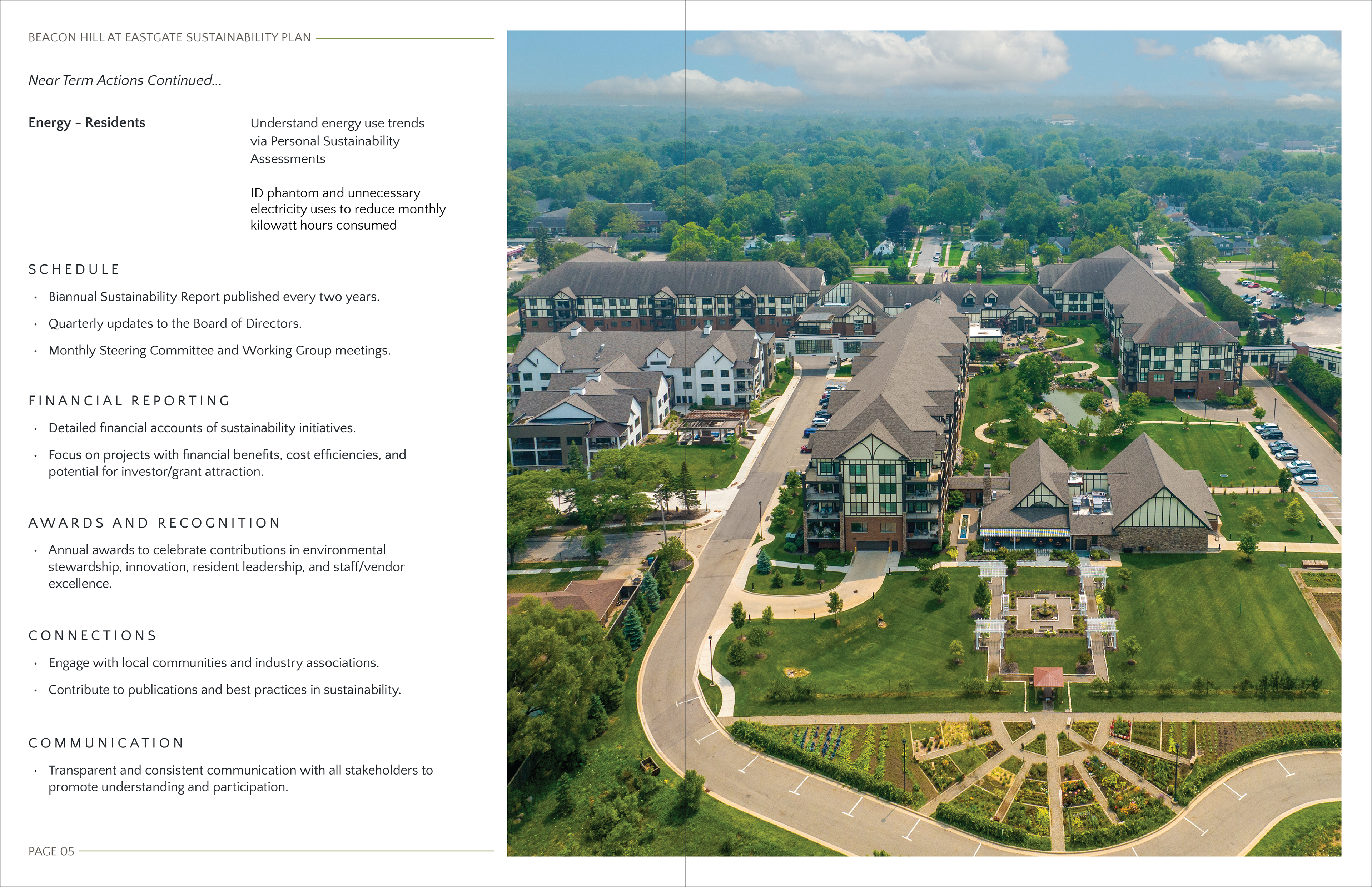
A commitment to sustainability & community
This was a long-term project created for Beacon Hill’s new sustainability initiative. It began as a digital PDF designed to fit in a binder for residents and staff. The layout needed to be clean, minimal, and easy to navigate while featuring photos of the grounds to highlight the natural environment. I followed Beacon Hill’s brand standards throughout, with no custom branding for this piece. After several rounds of edits and reviews, the PDF was adapted into a printed book, which I completed within a two-week turnaround.

Insights Gained
Through this project, I learned how to work with precision and stay detail-oriented across a longer timeline. I gained experience in layout design and learned how to stay flexible when project needs shift. Converting the piece for print taught me about book production and how to work efficiently under tight deadlines without sacrificing quality.